As a branding agency, we like to take note of the work that’s out there in order to stay up to date on the latest trends and reevaluate if older designs have held up to the test of time. Sports logos are some of the most prominently displayed and remembered in all of design. People get them tattooed on their body, they buy merchandise of all kinds, and paint their houses the color of their favorite sports teams. In other words, they’re a big deal to the people who care.
I’m a giant NBA fan and have been for as long as I can remember. Over the years, I’ve noted amazingly well-aged logos, as well as those that crashed and burned into the haze of basketball-past. This is my evaluation from a brand designer perspective of all current NBA logos before the opening of the 2019-2020 season. Let the controversy begin!
30. Oklahoma City Thunder
Since moving from Seattle to OKC, the Thunder have had some of the most divisive logo and jersey designs in the league. Many people praise their colors and have a weird affinity for their logo. Their jerseys do the best with what they have to work with. But, this logo is a travesty of 90’s schlock and general NBA cliches. Basketball inserted on a whim? Shield imagery done poorly? “Sports-y” font with random extra serifs added because that’s what sports teams are supposed to do? All present. The swoosh lines behind the shield create an unbalanced focal point to nowhere. The off-center OKC and basketball just confuse the balance all-around. The 4-color treatment makes for a lot of visual noise. Also, what does a shield and swoopy lines have to do with either Oklahoma City or thunder?
How to fix it?
Honor Native American history, especially with a name so close to the mythical thunderbird. OKC is in the heart of tornado alley, which brings awe-inspiring thunder to the area. Buffalo herds, once native to the great plains, are said to sound like rolling thunder. Amazing imagery abounds for this team, if only they would harness it.
29. Detroit Pistons
A metal growl shatters the silence of a small town road. A glistening 1969 Dodge Charger fires across the asphalt, paint gleaming, pistons firing on all cylinders. American muscle car imagery is poetically primal. And yet, here we are with a lackluster static red ball encircled by a random blue ring that only serves to add their secondary color. Along with the mandatory “sports” font once again prominently featuring (see the two sides of the T or the rounded off top of the N), this is just a poor showing all around.
How to fix it?
Motor city. Detroit rock city. The home of the American muscle car after which they’re named. Lean in, embrace, hell work on a modern revamp to your old 90s logo. Just do something.
28. Los Angeles Clippers
Always the bridesmaid (unless you’re Kawhi Leonard or Paul George). Since moving from San Diego into the shadow of the Lakers in Los Angeles, the Clippers have had mostly a tough go of things. In 2015 they proudly strode into the bright Los Angeles spotlights with a fresh new logo… and everyone hated it. I’m almost proud of them for trying, but that LAC or CLA mark is just strange and hard to read. Random swoopy line syndrome has re-emerged here (see OKC Thunder) and there are unnecessary text highlights on the word Clippers.
How to fix it?
This should be such a softball. NAUTICAL THEME. Clipper ships, anchors, compasses, ship wheels, ocean creatures, even salty sailors are better than this randomness. They have the entire ocean to work with and they’re swimming in a puddle next to Hollywood Boulevard.
27. Houston Rockets
Oh, Houston. I was ready to place them in the lower middle of the pack, but they went and outdid themselves for the 2019/2020 season. They already had an awkward extremely non-aerodynamic rockety R as their primary logo. But, they realized they were missing a crucial design element, an out of place basketball to show people what sport they’re in. So they stamped an impossibly huge dark gray basketball behind the already middling to poor logo and called it a win. The only upgrade is the font change from this abomination to something more palatable.
How to fix it?
There is so much history between this franchise, the city of Houston, and NASA as a symbol of the city that I find it insane that they can’t get this one right. Go old-school rocketeer style. Retro-futuristic rocket travel is a big look these days. Maybe embrace your Texas history like the fellow Houstonian Astros have.
26. Utah Jazz
Controversial pick time starts early in this post. What happens when you name a team after iconic music, move it from its original city to a state with stunning natural parks, and try to find an identity? In this case, you mix a musical note, a multi-color basketball, and a J into a convoluted word-mark that doubles as a lopsided secondary logo in the solo J form. The controversy comes because it’s been around forever and so many fans love it. But, if this came out today people would ridicule it mercilessly. Utah is in the upper right, making the word-mark read backwards. There are too many competing colors coming from one corner of the logo, drawing your eye down and to the left instead of across the words naturally. The basketball size doesn’t line up with the top of the AZZ and the center of the ball just barely doesn’t line up with the crossbar of the A. Aesthetically, it’s a mess.
How to fix it?
Did I mention the natural beauty of the Utah national parks already incorporated into their most popular jerseys? How about going full-on Bourbon Street jazz and hearkening back to your musical roots. So many old logos have gone by the wayside and I wouldn’t mind if this was the next to go.
25. Brooklyn Nets
Damn if they don’t have one of the hottest jersey colorways in the league. The Nets do the best they can with what they have, but this logo looks like a template from Squarespace. When the Nets moved from New Jersey to Brooklyn, they decided on a fresh start on all fronts. Their logo, for whatever reason, decided to play it safe. I know that the name “Nets” is one of the most generic sports names around. I hate it, but it has history. This logo contains neither a net nor a reference to Brooklyn at all, but it does contain the NBA logo cliches of both a prominent basketball and a haphazard shield. Thankfully, they chose a rather neutral font, but this thing packs zero punch.
How to fix it?
This is a tough assignment and one I would love to tackle as a designer. A net is boring, but basketball and Brooklyn are not. Brooklyn could lean into their new city‘s history and vibe. They could go old-school to reflect their throwback name. They could even attempt to work with net imagery. Baby steps are their friend and they should try something with this logo.
24. Orlando Magic
One of the weirdest names in professional sports, the Magic are essentially branded to unofficially represent Walt Disney World, aka Disney’s Magic Kingdom. While they did ditch the weird scratchy lettering and stars in place of both letters and tittles (yes, that’s a word) from their first logos, this doesn’t scream magic at all. There’s something going on with the streak behind the ball, but the stars seem oddly placed and only one is set in a perspective. The mandatory basketball is featured prominently (why is this a thing?) and for some reason its dominant magical color is gray.
How to fix it?
Follow the mouse. Embrace the mouse. They already have their name on your jersey, why not get some sweet fantasia vibes going on in Orlando? It wouldn’t be the first time Disney has let a character be used for a sports team. If the house of mouse won’t budge, they have so much great imagery to work with. Crystal (basket)ball? Black hat? White rabbit? If anything, just clean up the stars.
23. Cleveland Cavaliers
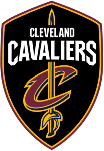
I know this was designed by Nike, but I still have some issues with this logo. Their colors are drowned out by the giant black shield behind the main logo. At least in this case, the shield and sword maybe kind of go together. The C around the sword makes very little sense and is visually bottom heavy. I will keep harping on “sports font” syndrome with this logo’s edition sharply chopping the bottom of the V for some reason. Overall, while decently executed it just feels really busy with too many elements.
How to fix it?
Their secondary logo is a big start. It’s clean and used in as many places as the primary. I think their best bet is to simplify. Use the sword or the cavalier himself more prominently. Maybe even go wildcard and incorporate an old school sigil to really get the sword fighting feel.
22. Indiana Pacers
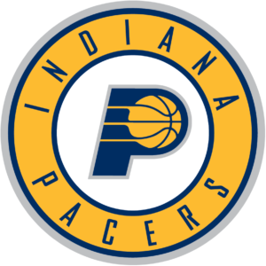
We’re working our way out of “please change this” territory and into “I have issues with it” land. The P here is nice enough, but with so much amazing Indianapolis racing imagery, this feels like a soft landing rather than a blazing photo finish. Gray outlines never did anyone any favors. A prominent basketball is the oldest of tricks, although done adequately here. Their font is actually perfect for this brand so props there.
How to fix it?
There are a ton of ideas to explore here. Checkered flags, racing tire streaks (actually meaningful lines instead of the swoopy lines prevalent in so many logos), or actual indy cars come to mind.
21. New York Knicks
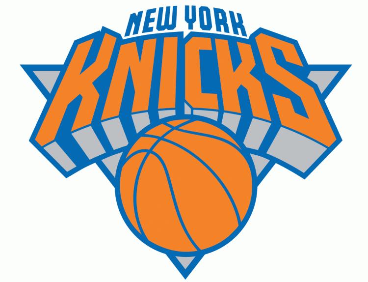
Some concepts are too good for their own execution. The idea of tilting the letters back ever so slightly to imitate the perspective of looking up at the New York skyline is impressively genius in a Milton Glaser kind of way. Otherwise, this is just not a great logo. We have a color scheme of pale orange, muted blue, and gray for one of the most vibrant cities in the world. New York is a world renowned city that is relegated to a tiny fixture atop the oddly three-dimensional Knicks. A giant basketball serves no purpose, and a giant gray triangle finishes out the shape of the logo because why not?
How to fix it?
City lights, gritty streets, heroic firefighters, a rebirth after a national tragedy, the birthplace of more basketball players than any other city. You have to work hard to not find a better logo than the current Knicks mark. I think Michael Weinstein nailed the logo redesign on this one, and the Knicks should really take note. I would buy all of the merch with this logo and I am not a Knicks fan.
This is Part 1 of a series. Parts 2 and 3 here:
2. NBA logo rankings for all 30 teams – middle of the road
3. NBA logo rankings for all 30 teams – best of the best
