Research began on the wide field of travel, as well as preliminary filming of test interviews to hone in the format and experience. Outside travel media was grouped and categorized, and the team determined attributes that led to a strategic brand position.
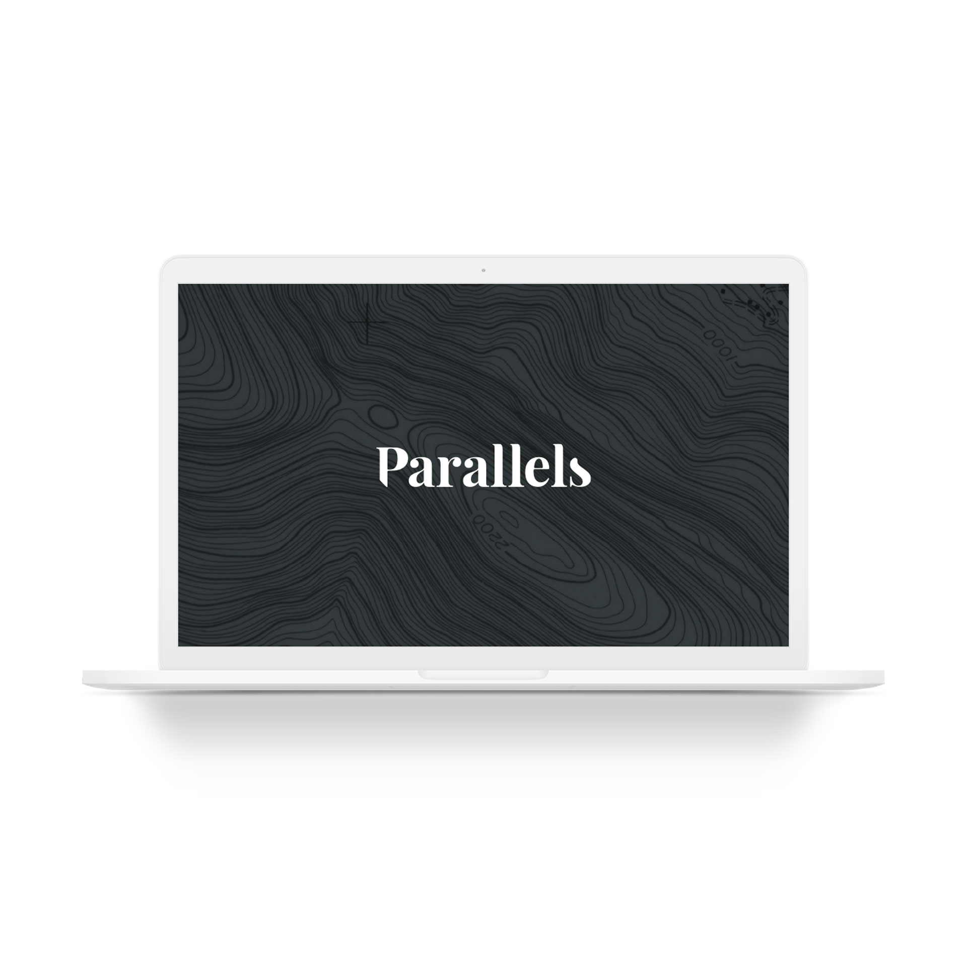
Parallels was chosen as the name because it describes the parallel lives that each of us are living all over the globe. It also evokes the latitude and longitude lines of a globe. Parallels: Travel the world one story at a time.
For the Parallels logo, a custom logotype was designed, composed of the letters in a sentence case serif typeface. Special emphasis was placed on the “P” as both the social media emblem and the first letter of the wordmark. 45 degree sections of the first and last letters were removed to evoke a sense of existing between parallel, but unseen lines. The colors are intentionally muted, in order to let the colorful content of the world shine as the star of each show.